


Wakefield Press and Weird Fiction Paperback Covers
Wakefield Press and Weird Fiction Paperback Covers
Interview with Marc Lowenthal on Wakefield Press paperback cover design

I came across the Wakefield Press website while researching Boris Vian, a remarkable, but forgotten, French writer (1920-19959). I was delighted to discover that Wakefield has published two Vian titles in smart paperback editions: Vercoquin and the Plankton and Trouble in the Swaths. Both books had striking and unique cover designs (see below) and as I prowled through their list of books I noticed that all of their books featured superb cover design.

Here is the description of their publishing house from their website:
Wakefield Press is an independent American publisher devoted to the translation of overlooked gems and literary oddities in small, affordable, yet elegant paperback editions. Our publications include the Wakefield Handbooks series (the guidebook as imagined through literature), the Imagining Architecture series (architecture as imagined through literature), and the Imagining Science series (science as imagined through literature), as well as forays into classic experimental fiction (literature as imagined through literature). Authors range from literary giants to those underrepresented (or unknown) in English.
Intrigued by their poetic cover designs and the obscure/forgotten authors they publish, I contacted them through their website and got a very nice response from Marc Lowenthal, who founded the press in 2009.

How did Wakefield Press begin and what are its goals?
March Lowenthal: We started in 2009, with our first two titles coming out in the spring of 2010. The goals with Wakefield Press are all personal ones: the early titles were projects I had been sitting on and I wasn’t up for trying to place them with other publishers, but I’d always wanted to run my own imprint and put out books I would want on my own bookshelves. 14 years later, and now working with a range of different translators on a range of different sorts of projects, the whole thing remains personal, and necessarily so, since the Press doesn’t make money.
My early inspiration was the publishers I turned to as a reader; publishers with a unity to their catalog that makes anything they put out of interest to a reader who gravitates to them: Twisted Spoon Press, Atlas Press, Editions Allia, etc. So personal interests hopefully create some sort of coherency to what we do, but without that getting us stuck in a rut or easily pigeonholed.
What is the workflow on a typical cover design?
Nothing too interesting to report here: I get a deadline by which our distributor needs a cover for a new title we’re announcing and workflow is whatever enables me to get it to them. Wakefield is just my wife and myself, and we both work day jobs, so workflow is anything but consistent. But if you mean how do I come up with ideas for a cover: because our books are historical in nature (usually new translations and the first appearance of the book in English, but these are generally texts from the nineteenth or twentieth century), that will steer how I approach the cover.
Sometimes, as with the covers to our books by Mynona, it means adapting the covers from the original-language editions; with some of our books that include the illustrations from the original edition (such as our titles by Curt Corrinth, Paul Scheerbart, or Otto Julius Bierbaum), I’ll draw on an interior illustration for the cover. And sometimes, as with our books by Jean Ray or Marcel Schwob, I draw on and continue the visual theme that I’ve already established for their books in our catalog.

Do you have any favorite covers?
I should say that I’m not a professional designer: after all this time, I still manage to screw up on details, which a professional designer probably can spot, so I speak as an engaged amateur here. I am more involved with the content of our books than a designer at a larger publisher probably is (or has time to be, since their job is design, not editing, acquiring, etc.), and there is a thought process, so: I am pleased with the visual identity I think we’ve created for some of our authors.
For our Marcel Schwob books, I’ve been using the photographs of John Yang, who was still alive when I was first introduced to his Mount Zion series from which the photographs we’ve used are drawn from. They are photographs of photographs, specifically the photo-portraits of the deceased found on some of the gravestones in a New York Jewish Cemetery (the name of which is that of the series), eroded or faded by the years, or damaged by vandalism.
They are haunting, evocative images of forgotten or faded figures of the past (which itself describes some of Schwob’s stories), but the fact that they come from a Jewish cemetery, while not an overt detail, acknowledges for me Schwob’s Jewishness, which was no small matter for a French author, let alone an influential French author, in the years of the Dreyfus Affair.
I also like the visual identity we have for our string of books by Jean Ray, though I have to credit Will Schofield of 50 Watts, who introduced me to the Rochester collection of decayed nitrate film stills that we’ve been drawing from for them. The imagery there ties into several elements that Ray’s writing evokes for me (which can’t be said of all Francophone weird literature of that era): a modern prose style (as opposed to the ornate style that some of that literature can engage in), with filmic elements to his narratives and imagery; the nightmarish quality that the decayed film stock adds to the already oneiric atmosphere an isolated film still embodies from anything of that era.

Finally, as Scott Nicolay, the translator of the books, emphasizes in one of his introductions, Ray was an early author to generate horror fiction from musings on the fourth dimension, so the visual pointers to something outside the film frame, and the exposure of materiality outside the image and the invasion of what lies between film frames into the image itself, with two dimensions visually bleeding into each other, also speaks to the themes of some of Ray’s most successful stories. Individual covers, even when the decayed nitrate has rendered into something almost completely abstract, point to specifics of the books themselves: the glowing sea under a nightmarish sky of Cruise of Shadows, the whiskey hues to Whiskey Tales, what to me resembles an overwhelming visceral cloud swallowing up the sky over an oppressed landscape of The Great Nocturnal.

And I love the match-up of the paintings of Nicole Duennebier we have with the writing of Gabrielle Wittkop. Duennebier is actually a neighbor of ours whom I met through a mutual friend, but an incredibly gifted painter and you couldn’t ask for a better or more suitable visual companion to Wittkop’s gamey prose than Duennebier’s baroque, lush, almost grotesque subversion of classical Dutch memento mori painting. She’s agreed to our using another painting of hers for what I’m hoping will be a third book by Wittkop for our catalog.
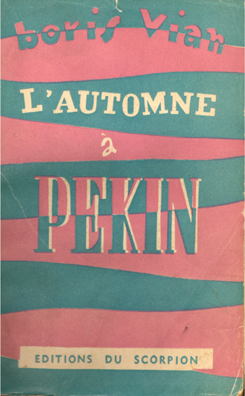
I'm so glad you published Boris Vian as I've always loved his plays and novels. How did you come up with the covers for Vercoquin and Troubles?
The Vian covers allude to an old volume (vol. 8-9) of Obliques devoted to Vian, Boris Vian de A à Z, which itself alluded to the covers of the first appearances of some of his novels from Editions du Scorpion; which I felt was a zany enough treatment for these first two novels, which were his most slapstick (and certainly melancholia would thereafter start tinging his pop-surrealist sensibility). The drawing on Vercoquin is by Roland Topor and was on the cover of the original French edition. An example of my spending extra money for the sake of a detail that is less than overt (it doesn’t really look like a Topor drawing). I was going to do the same for Swaths, but we were unable to determine the source of the image, so I ended up using some public domain clip art that captured the period comic-book cartoon-violence feel of the narrative.

What book or books would you recommend to a reader new to the Wakefield Press? Also, I'm a big fan of the original Black Lizard noir novel series and found that the publisher, Barry Gifford, based it on the French Serie Noire from Gallimard; many of the books in the Gallimard series are only in French. I know the books are more pop fiction, but I'd love to see Wakefield translate some of those French Authors.
In my opinion, The Book of Monelle by Marcel Schwob is one of the most beautiful books ever written.
I am a fan of a lot of post-68 French crime fiction (though it was seeing Jim Thompson available in French and not in English that I think was the original inspiration for Gifford), and am not opposed to genre literature (of which some of our catalog could be said to fall). It’s a bit of a large swath you’re presenting, though, and the biggest risk a small publisher runs is in trying to do too much, which is the most common path to collapse (and one I nonetheless flirt with). We have some titles that could arguably fall into the mystery/crime genre, albeit obliquely (Krazdock the Onion Man by Louis Levy, Murder Most Serene by Gabrielle Wittkop, The City of Unspeakable Fear by Jean Ray, our forthcoming Vacated Landscape by Jean Lahougue): but these represent works that fray the edges of genre more than ones that fit comfortably within them.
Thanks for your time, Marc. I love your press and am looking forward to discovering new authors
Thank you for taking an interest in what we’re doing.
……………
COVER GALLERY


